Hello and welcome to A1 Excel! In today's post I'll go over situations when you'll want to include a Chart to accompany a data summary and how to make it concise for your audience. In my own experience I've been in situations where I could've used a chart to help tell the story of the data that I am presenting/sharing. This can be especially useful for highlighting major operational shifts that occur on a timeline that impact sales (as an example) or tracking changes in staffing over a period of time.
Below you'll see examples of both along with explanations on the type of formatting utilized:
Line Charts:
In this example I'll show you how you can utilize line charts to show headcount shifts over the course of a year. Personally, I've used a similar chart to highlight headcount shifts on a monthly basis as part of a presentation to Directors regarding their business unit's financial performance. When it comes to formatting these types of charts its best to keep it as clean as possible so your audience can quickly glean information from it while you are going over your talking points during the presentation. Personally, I prefer neutral colors for the lines in a chart or coordinating with your company's color scheme. This way if you need to put in a similar chart to an Executive level presentation then you don't need to stress over major formatting updates.
Here is our dataset we'll use regarding FTE Actuals, Forecast and Budget for our fictional Department A for 2023 Results so far:

To note: As this is for 2023 results as of late October'23 we do not have our actuals yet for Oct-Dec.
To create a chart select your dataset and click on Recommended Charts:

You will then follow the prompts to select the type of chart you want to showcase your data:
*This is what I'm selecting to show in this example:

From here you can format it however you like or need it to be. If it feels appropriate to include a data table as a chart element you can definitely do so or you can leave it out:

This chart can provide a neat way to show the changes in FTE overtime as well as any spikes or alignment in the metrics.
Bar Charts:
In this example I'll go over how to use a bar chart to highlight operational impacts. Here is our dataset below which covers Car deliveries:

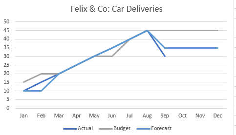
As you can see this drop off in car deliveries hits operationally starting in September. Based on info from our company (purely fictional) we know this delay in Car Deliveries is from a shortage in materials on the manufacturer's end. This type of impact will negatively hit the financials in Q4. Similar to the Line Chart example above we will select our data to insert a bar chart to get our result below:

Given the type of data we have we can also show this in line format to really show the plummet in September's car deliveries:

Depending on the type of data you need to show in a presentation or for your own personal use don't be afraid to change up the format, there are so many options available for formatting.
As easy as it is to create a chart with a data summary table we must be careful to not go overboard on having too many charts in a spreadsheet summary. Personally I recommend one chart to provide a strong emphasis on the data summary points to highlight events that have an operational impact or to have a clean viewpoint.
If you'd like to learn more about other types of charts I have a template listed in the Products section of the website that you can use/modify for your own personal use.
Thank you for reading!
Comments